In a few hours I'm hoping and praying to go live with my website. It's been a long but exciting process and I'm so ready to get it up and running. As I've been building my website I've also been building and developing my logo. Maybe you've seen it around, it's the two little i's hanging out at the corner of some of my recent pictures. But I've taken it a step further and had some fun with it. I love it and hope everyone else likes it, so please let me know what you think.

I finally took to the drawing board the other day, and doodled the logo that has been brewing inside my head. I may have studied graphic design for a bit, but It's been awhile since I designed anything, coming up with my own logo did not come easy. But through the design process my friend's have been soo amazing and encouraging I wouldn't have had the confidence to design it with out their help.

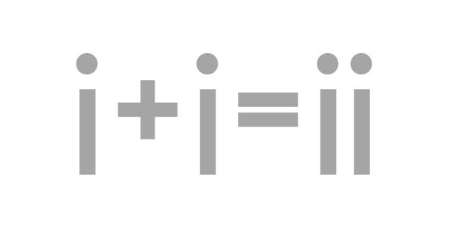
Besides the obvious, the initials for ica images is ii, the idea behind my logo is that no life should be lived alone but together with another. Two i's are always better than one. And aren't memories so much sweeter when you have someone to share them with? It's as easy as 1+1=2.

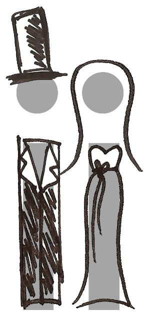
So ladies and gentlemen here is my finished product!
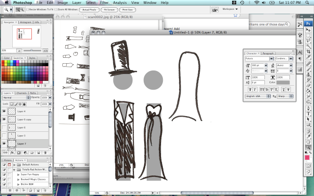
It's everything I envisioned my business to be; whimsical, vintagey, but with a little bit of funk. And who knew two little i's could be so stinkin' cute? If you are wondering how I created it, I literally drew it out. I took out a piece of paper and a pen and doodled little brides and grooms till I was satisfied. Then I scanned it and placed the outfits on top of my two little i's. Ta-da!
I'm not the greatest graphic designer in the world ... I know, but I'm so happy with how things turned out. I definitely miss designing, and still have much more I want to learn. I haven't given up on graphic design just yet, I'm determined to finish school some day. But for now I am so satisfied to be doing art in any form, I'm so blessed to be doing photography.
I'm not the greatest graphic designer in the world ... I know, but I'm so happy with how things turned out. I definitely miss designing, and still have much more I want to learn. I haven't given up on graphic design just yet, I'm determined to finish school some day. But for now I am so satisfied to be doing art in any form, I'm so blessed to be doing photography.


hehe, i knew it! those "i's" are from a cropped wii logo aren't they? i only ask because i did a nintendo business model presentation in old country and played with it a bit as well. love how this turned out though :)
ReplyDeleteOh my word! That is the cutest thing I have ever seen! So creative!
ReplyDeleteThat is the cutest logo I have ever seen! I really love it!! :) It suits you very well, good job. :)
ReplyDeleteNot only is it original, fresh and totally fun...its unique and it took a lot of thought. People will see your logo and know you are young with new and exciting ideas and I'm positive that it will launch your business. Everything just goes so well together and my hat is off to you m'lady!
ReplyDeleteCUTE!
ReplyDeleteToo cute, Ica!!!
ReplyDeleteYou are SO creative :) Isn't wonderful when patience pays off and you get something fabulous?!?!
Can't WAIT to see your website!!
Blessings!
That's hot right thurr. Yo Mad creative skills right thurr. I think you should pick a more encompassing logo though. You are a wedding and lifestyle photograher, so choose something that honors the fullness of life. Weddings is just a part of who you are as a photographer. Oh yeah and make it in of course the Ica signature style, keeping it funky but not smelly. lol
ReplyDeleteGod Bless
that is SO stinkin' cute i LOVE it!
ReplyDelete